You find the Eastmark visitor center at 10100 East Ray Road. This management group succeeds in creating a neighborhood look and feel by incorporating parks, lining streets with trees, allowing for commercial venues and creating residential communities that meet your needs. To ensure that the area maintains its commercial and residential appeal, Eastmark has put in place a community governance program that is practical and location-oriented. When its management team needed HOA community amenity signs in Mesa, AZ, it contacted our graphic artists for assistance.
Facility Signage Promotes Safety and Wayfinding

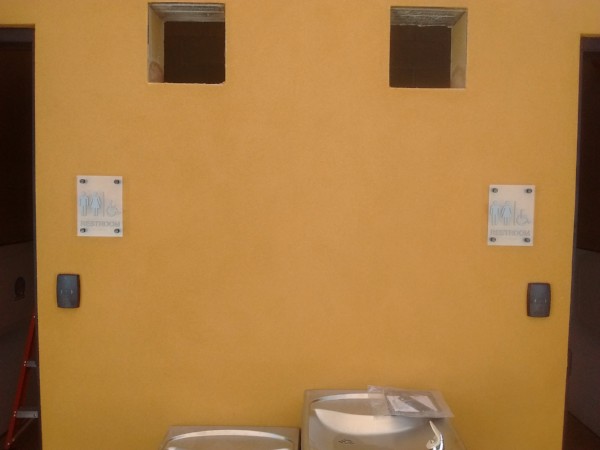
Our work focused on the pool area. We designed, manufactured and installed durable changing room signs that feature matte acrylic with silver symbols and lettering. To ensure compliance with the ADA (Americans with Disabilities Act), we added Braille dots right underneath the lettering. Our technicians installed the signs with standoffs, which allow janitorial staff members to hose down the walls behind the signs during scheduled cleanings. The restroom signs we created are similar in look and installation method.

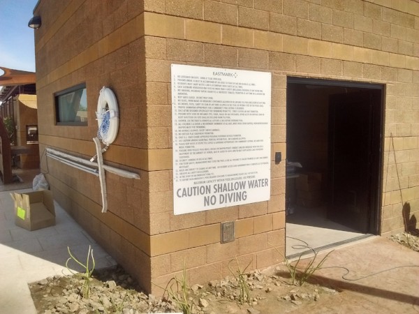
For the pool area rules, we imprinted a panel with the regulations and safety information Eastmark requires its residents and their guests to know. Part of the sign notes the person limit for the enclosure. We rendered the most severe warning, “no diving,” in capital letters to draw attention to it. Our installer mounted this sign flush to the wall with screws, which ensures a permanent display that will last for years. The sign is sufficiently tall to commandeer attention, which was one of the goals the management team had. At the same time, it is not so overpowering by color choice or symbol use that it detracts from the attractive look of the setting.
Having Your Signage Fit in and Stand Out
The goal of having residents see your sign is at odds with your desire to have it blend in attractively with the rest of your landscaping. After all, the color combinations selected for amenities, planned neighborhoods, and commercial facilities are designed to promote a coming together, which results in the presentation of a beautiful setting that is devoid of the jarring color changes and style oddities you see in so many other areas.
For signage to fulfill its designated roles, working with a full-service sign shop is a plus in this situation.
- ADA signs. In the past, the most jarring contrast for any setting would be the ADA signage. Because of the required color contrast level, the tone choices were frequently poor. Modern materials make it possible to design attractive signage that still assists with ADA compliance but does so in a muted manner.
- Safety signs. Unless a sign is mandated to feature specified colors by federal or state regulatory bodies, you have the decision-making power for color choices. We recommend the use of white backdrops and gray or burnt umber lettering, which perfectly contrasts but does not create an “in your face” look that takes away from the color scheme of the surroundings.
Contact our sign experts today to learn more about signs for HOA communities in Mesa, AZ, and to find out how you can benefit from their expertise when it comes to the design of markers that fit in perfectly.